BART approached TBD* with coming up with an innovative solution to use data, statistics, and upcoming BART improvements to create an advertisement that would encourage ridership. My team and I brainstormed together and I concepted the idea of type-setting common BART user-experience complaints against hand-lettered
graffitti.” When one rides BART trains you can commonly see vandalism and graffitti, I wanted to use this mechanism to encourage ridership and inform riders about upcoming BART initiatives and improvements.
graffitti.” When one rides BART trains you can commonly see vandalism and graffitti, I wanted to use this mechanism to encourage ridership and inform riders about upcoming BART initiatives and improvements.
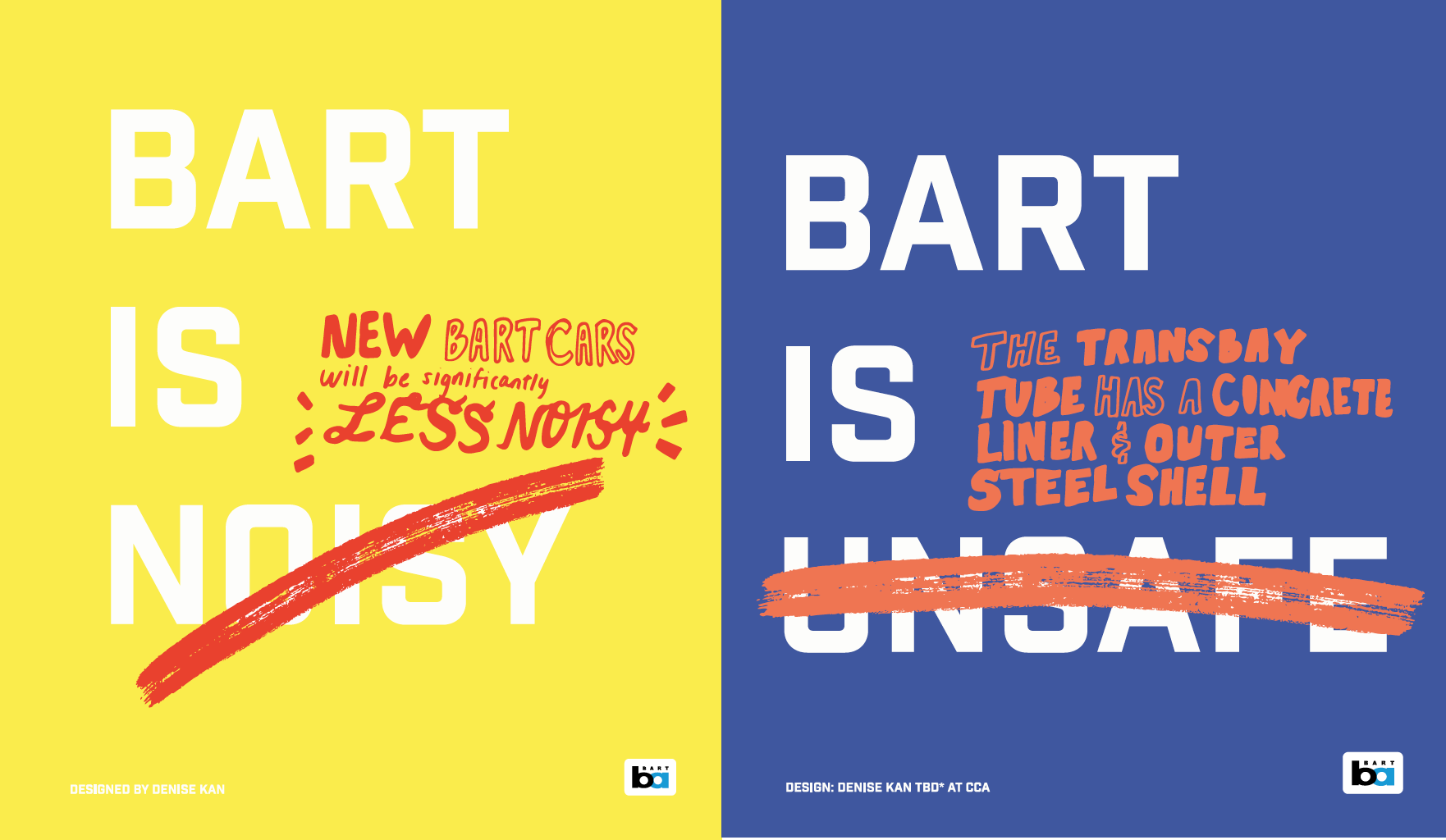

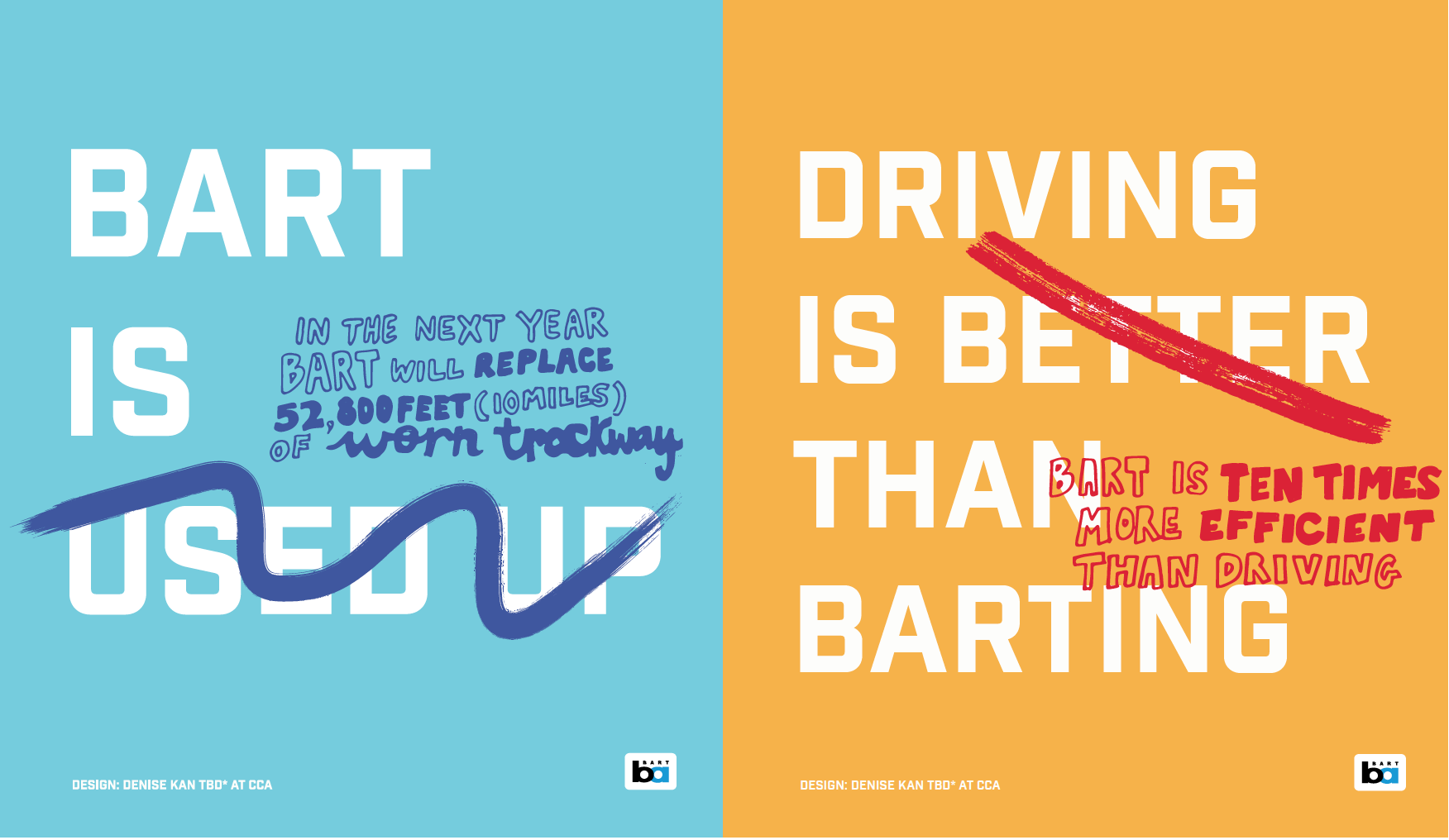
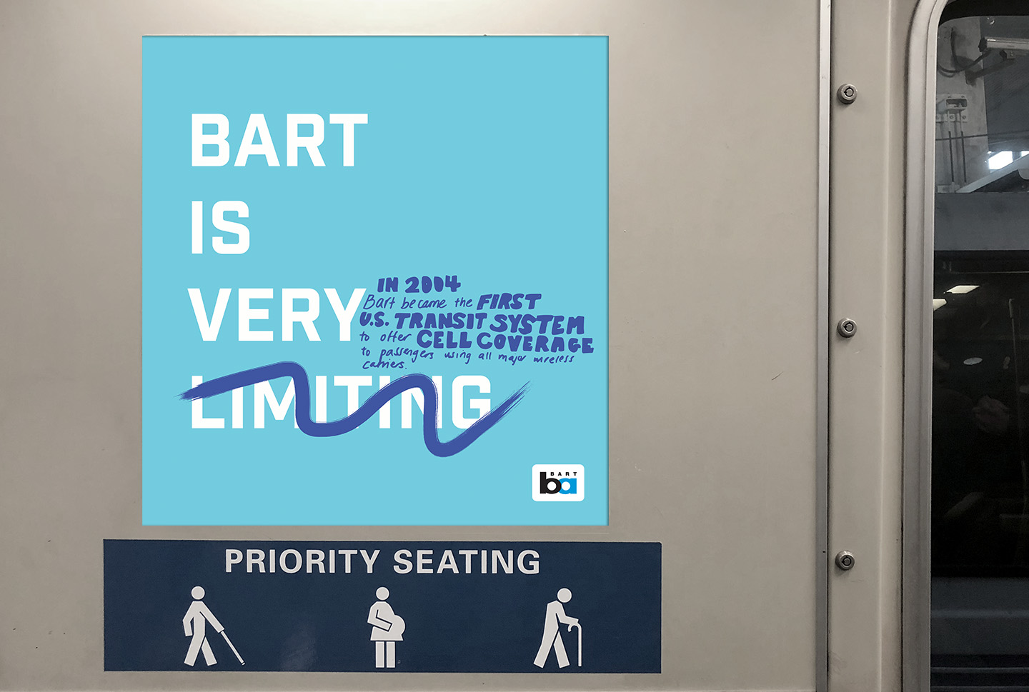
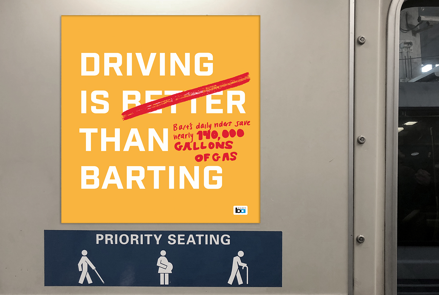
Graffiti was the mechanism I wanted to use to attract the viwer’s attention to encourage and excite them about upcoming BART improvements. The challenge with the design was figuring out what facts to use and how to condense the typography and make it legible on a quick read. The color palette I used was simple and a brighter version of primary colors. Typeface used was Industry, as I wanted a clean sans serif font that is legible at a distance.


Return