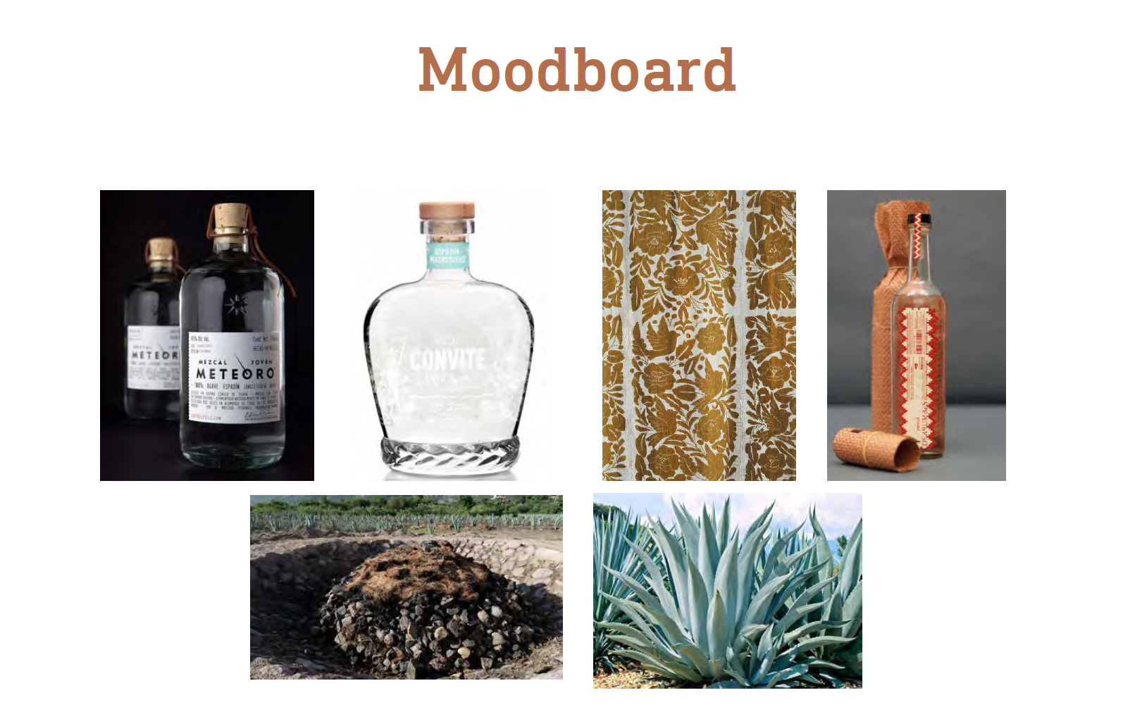
Inspired by the landscapes of Oaxaca, Mexico, Fogota translates to an inside fire in Spanish. Fogota’s branding considers the distilling process where sacred traditions are used to produce the mezcal spirit. Agave hearts are cooked in stone fire ovens for up to ten days to reach it’s full flavor and then left to ferment before distillation. Fogota Mezcal has not forgotten it’s roots and evokes pride in it’s process of craft and luxury.
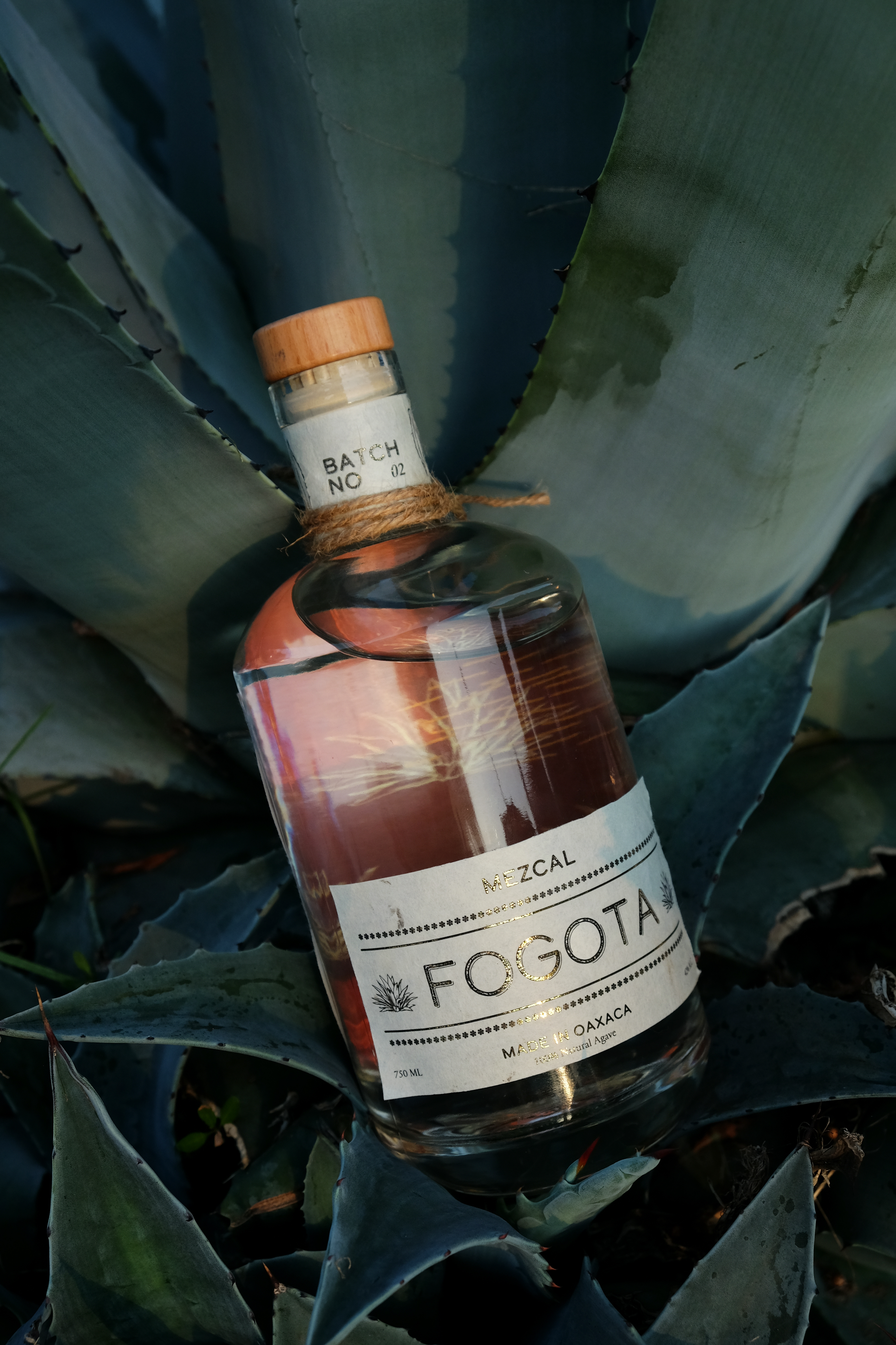


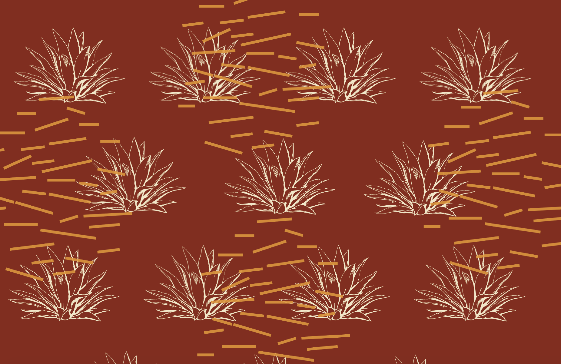
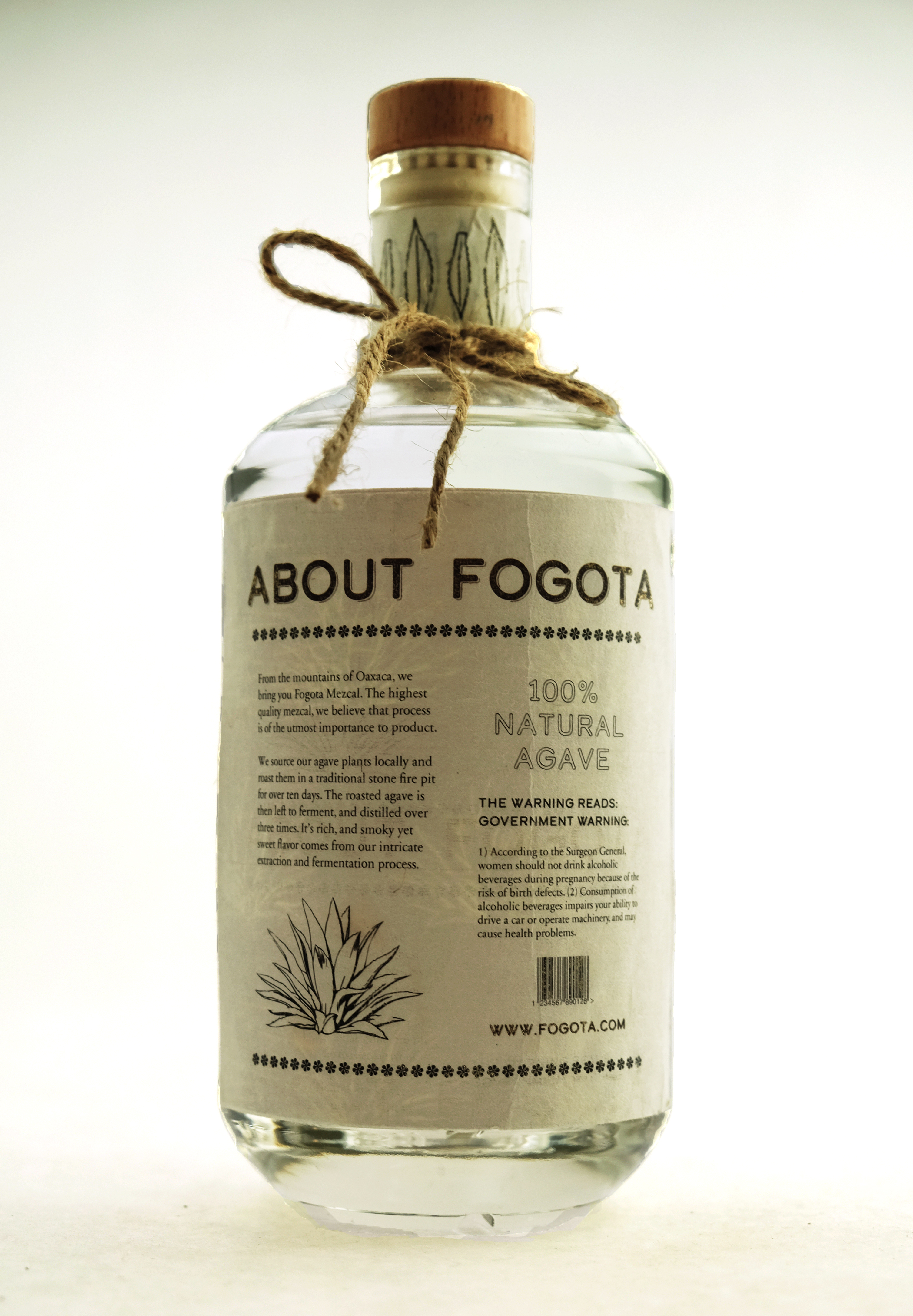

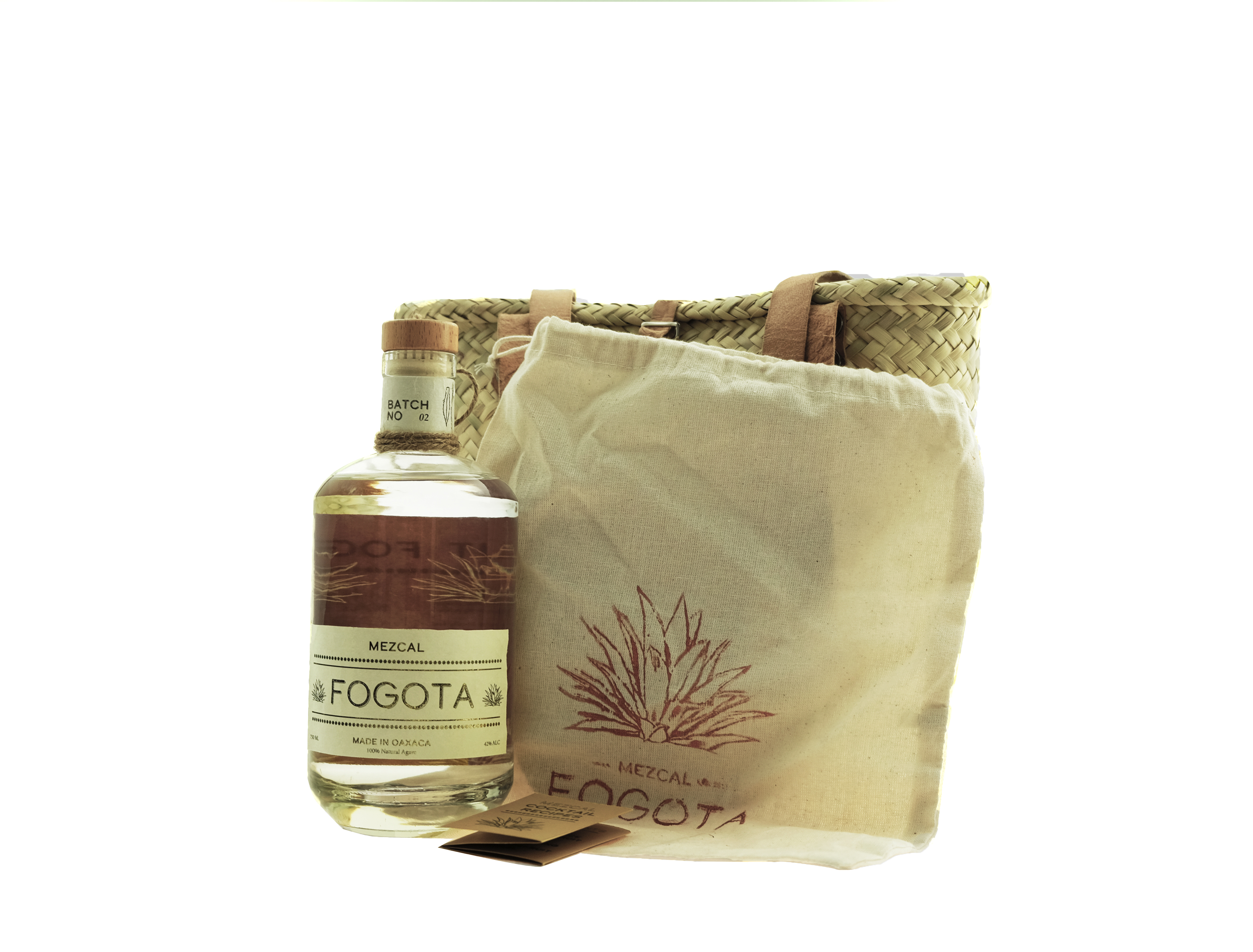

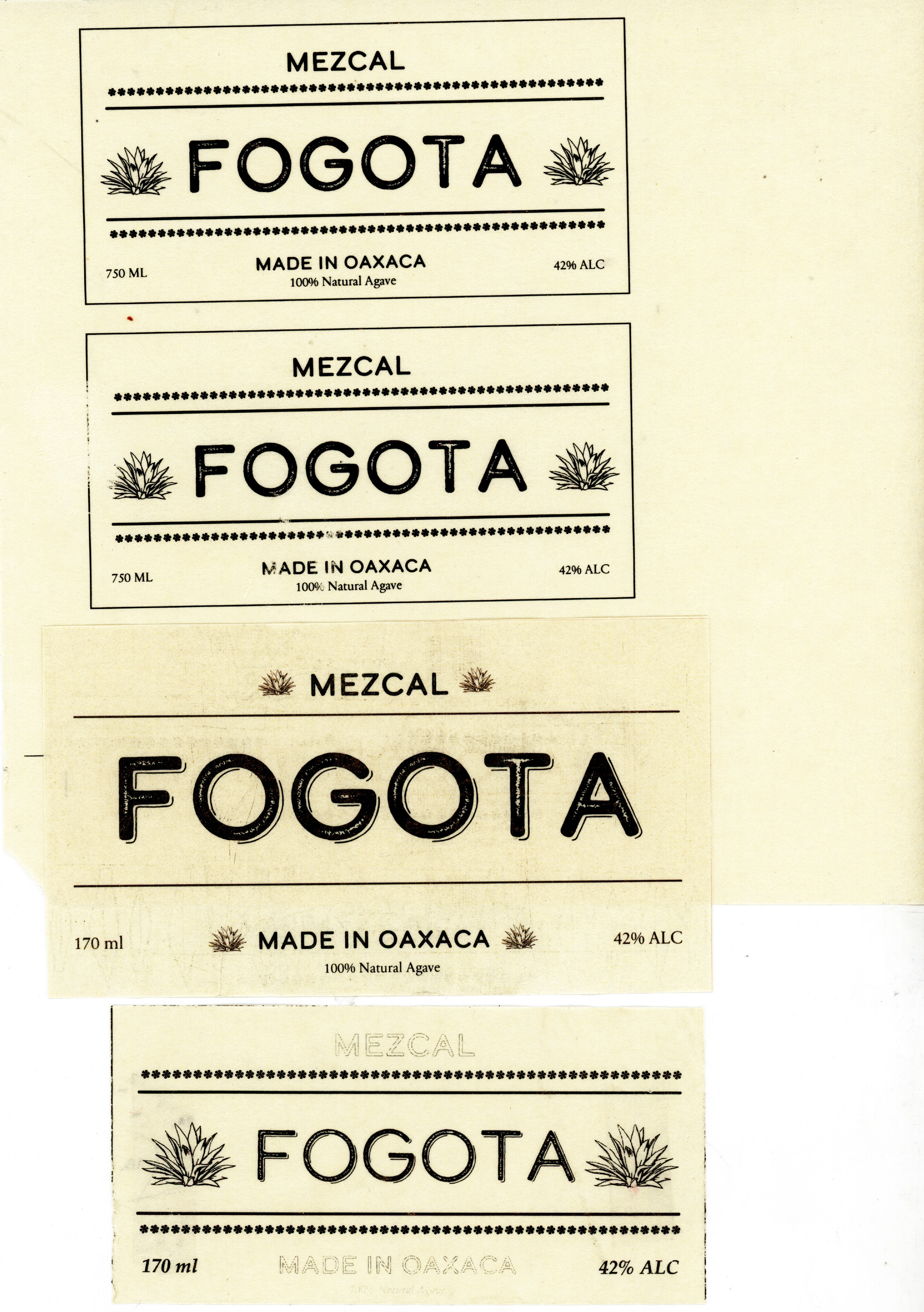
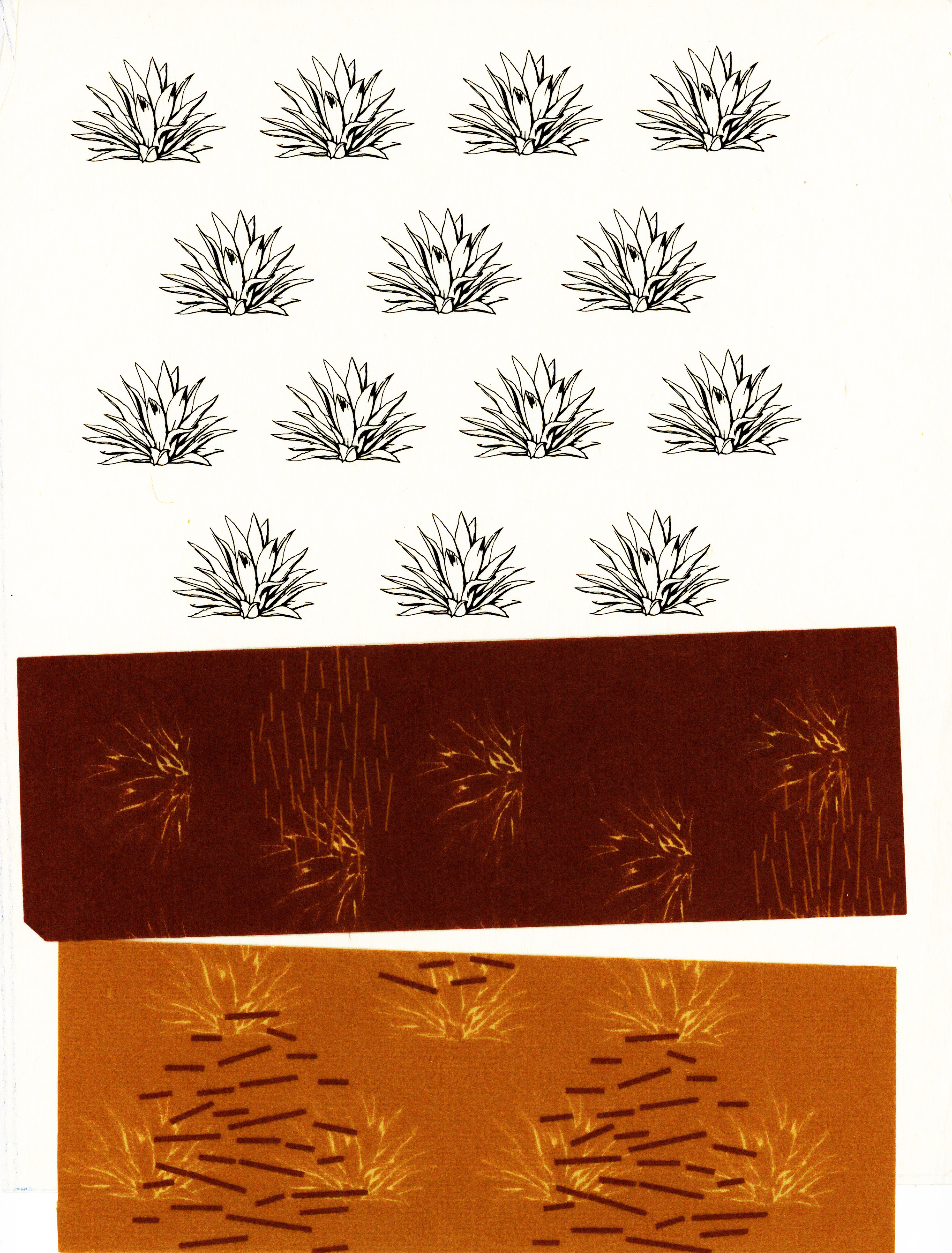
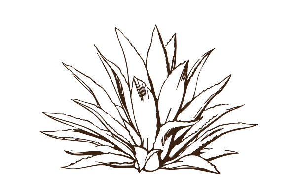
The pattern and main icon for Fogota Mezcal is the agave plant. I wanted to depict the agave plant in its natural form but also with the shape of a flame. The agave plant is also utilized as a pattern that creates repetition for the sense of fire. I played wit many color schemes to evoke the fire theme and also experimented with many different icons sets at first such as the Dahlia flower. The process of creating the Fogota Mezcal brand required alot of experimentation through materials to evoke a sense of specialty craft. From twine to leatherstrips, to straw I wanted the materality of the brand to evoke the hand-skilled craft of Oaxaca. I also printed all the labels on delicate rice paper and added a rough gold foiling which is a reminder of the agave burning process. For my typefaces I used Calder Dark Grit, subtext was with Calder Dark and for the body text I used Sabon Display. Calder is a clean sans serif font that also is reminiscent of fire, burning, and has a gritty tone that is the essence of the Fogota brand. Sabon Display is a clean typeface that is elegant and thin without lacking legibility.