At Chronicle Books, I worked alongside my creative director, and the marketing team to generate compelling advertisements (print and digital) to help promote books from all departments (Food+Lifestyle, Children’s, Adult’s Publishing, and Entertainment). Both A List titles, and top-selling Chronicle Children’s book titles I designed engaging print collateral but not limited to mailing labels, author praise sheets, stickers, activity sheets for children, web ads, and landing pages for Chronicle Book’s website and Instapages.
Chronicle Books Marketing
The Next President


Process
At the beginning of the design process before generating assets for marketing materials, I work with the marketing team to identify the characters they needed from the book spreads and to isolate them in photoshop to prepare design elements.

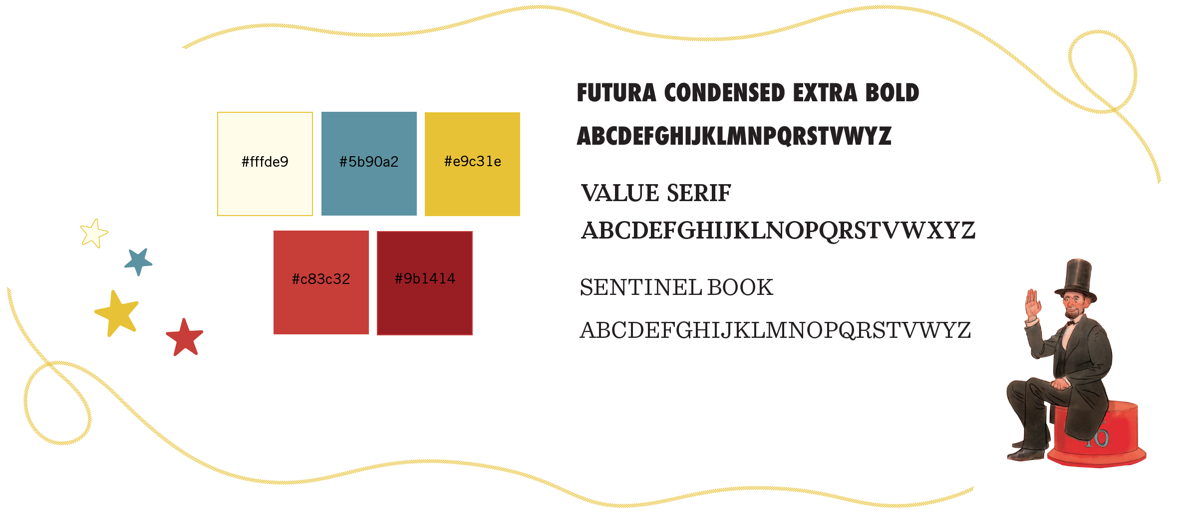
Design System
Before beginning designs for any marketing or advertising I pull design elements, typefaces, and color palettes from the book’s design files to create a visual library before moving forward with any in-house Chronicle Book advertising or campaign needs.
Design Iteration
Early design directions for the Next President quiz sheet involved creatively solving how visual we wanted the worksheets to be and how the activity would read and be resolved. Ultimately it was decided the red was too dark of a background, and that if there were direct visuals of the presidents, the worksheet would be easier to fill out.

Early design iterations with the mailing labels that I created. With early design iterations, I tested the legibility of typefaces in the book as well as the prominence of the book cover.
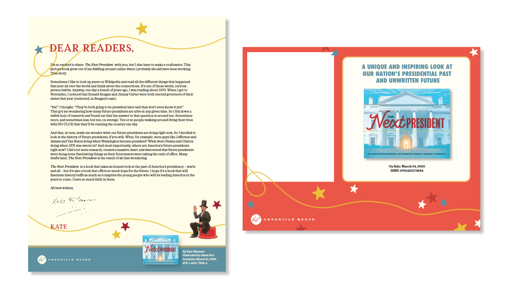
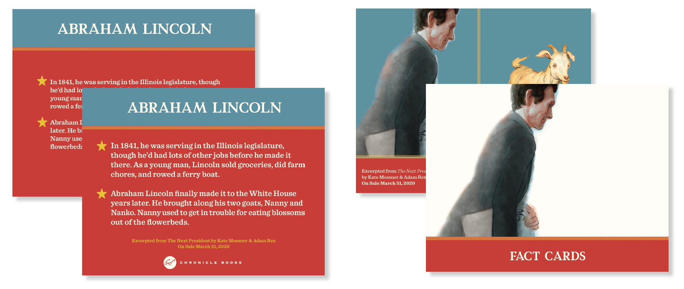
In early iterations of the creation of the fact cards, I worked closely with the marketing team to cut back on copy for the cards. Through design iterations and color experimentation, I worked with the team to identify the hierarchy of the information placed on the cards from the release date versus to he content of the book and the title.
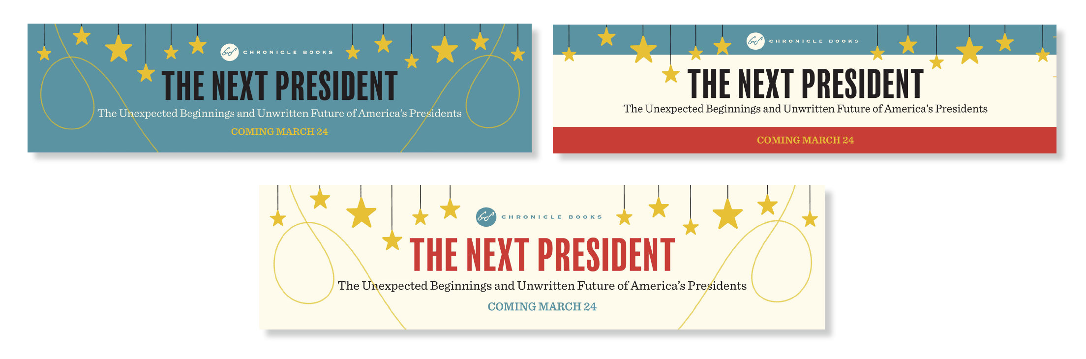
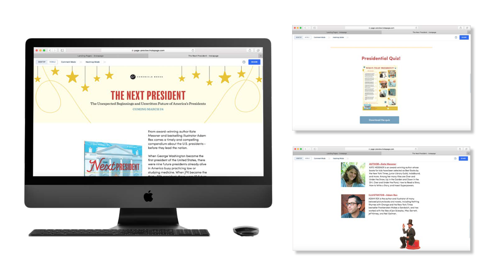
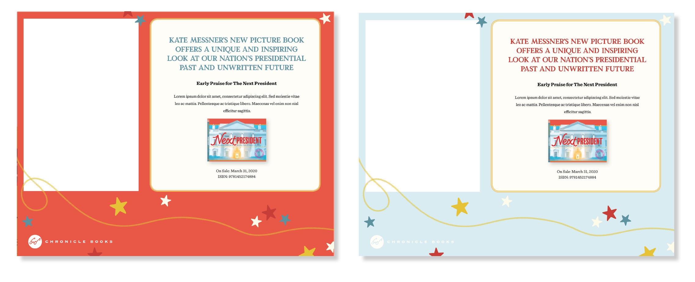
Design directions presented for the Insta-page headers for our landing page. Ultimately the simplest direction with most typographic visibility with the cream-colored background was chosen.